No products in the cart.
Return To Shop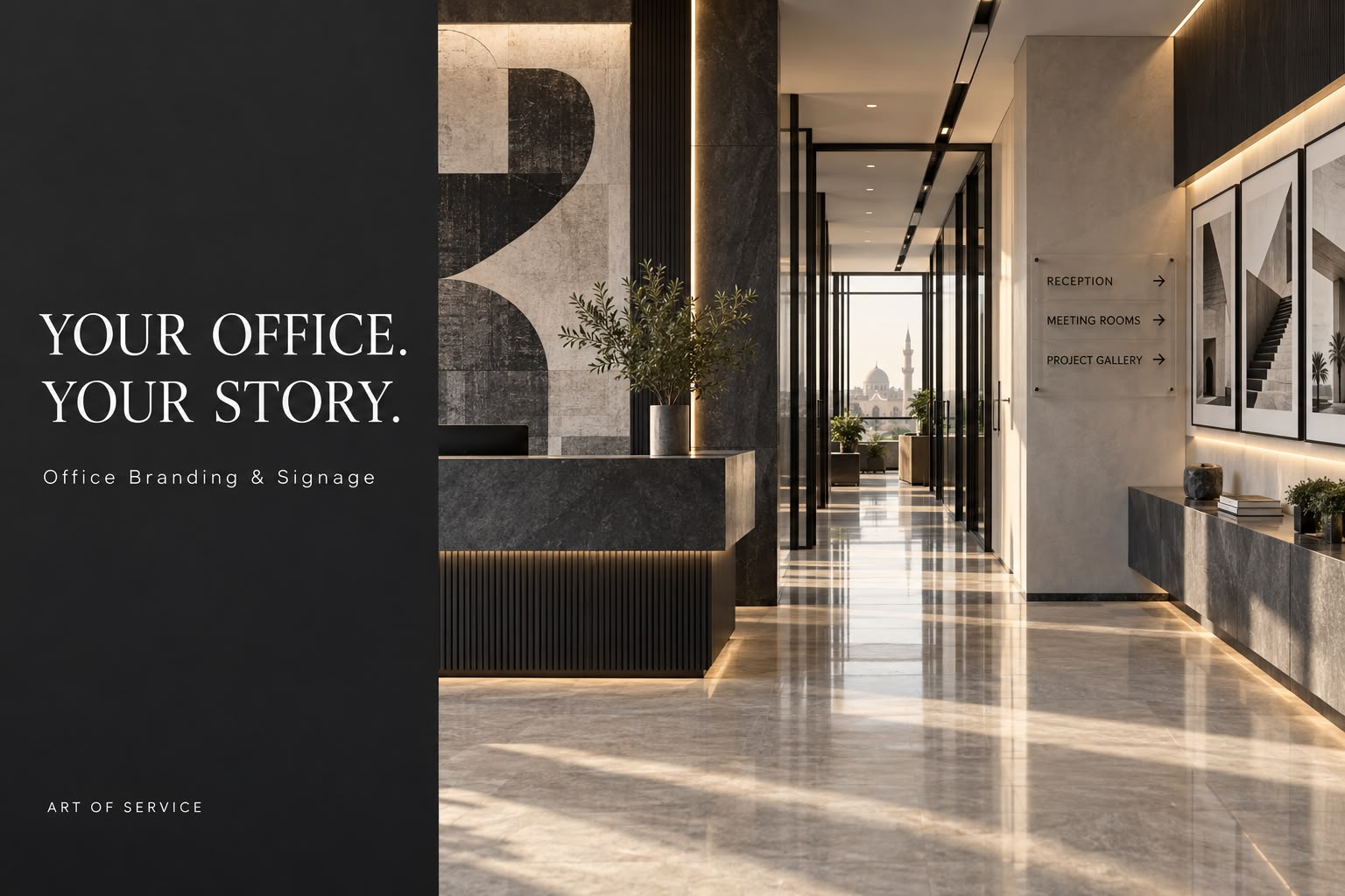
Your Office Is a Living Company Profile. What Does It Say About You?
A company profile explains your business. Your office lets people experience it.
Before a presentation begins, visitors have already encountered your entrance, reception, signage and meeting space. New employees experience those same details while trying to understand the company they have joined.
That makes office branding a useful business question: if the walls, signs and printed materials could speak, would they tell the same story as your sales team?
Design a Journey, Not a Collection of Branded Walls
Start with the route a visitor actually takes. The entrance should make the company easy to identify. Reception should communicate what the business does. Direction signs should help people move confidently. A meeting room should support a clear, professional conversation.
Each touchpoint has a different job. Placing the same logo everywhere misses the opportunity to use the space more thoughtfully.
For example, a manufacturing business might use reception to introduce its capabilities, a corridor to explain its production journey, and a meeting room to display selected applications. A professional services company might focus on clarity, discretion and a restrained visual identity.
The right approach begins with the business, then translates it into the space.
Make Your Strongest Proof Visible
Values such as quality and commitment are easy to print. Evidence takes more thought.
Instead of filling an entire wall with broad promises, consider a carefully selected project story, a product display, or a simple explanation of how your team works. Use only client names, photographs and results you have permission to publish.
Keep the display easy to update. Removable panels, replaceable printed inserts and modular arrangements can prevent the office from becoming a permanent record of an outdated company profile.
Connect the Physical and Digital Experience
A discreet QR code beside a project display can lead visitors to a relevant portfolio or company profile. Its purpose should be clear before anyone scans it.
Test it from the expected viewing distance, on more than one phone, and under the actual office lighting. Use a destination you control so the content can change without reprinting the display. Keep the key information visible in the space itself.
This approach gives visitors a way to continue exploring after the meeting ends.
Choose Materials for the Real Environment
A material that looks impressive in a mockup may behave differently beside a bright window or in a busy corridor.
Before production, check wall condition, viewing distance, lighting, cleaning needs and installation access. Glass graphics require particular care with visibility and privacy. Acrylic signs need suitable fixing methods and readable contrast.
A sample or small test installation can reveal issues before the full rollout.
Begin with Three Touchpoints
You do not need to redesign the entire office at once. Begin with the entrance, reception and one meeting space.
Give each area a clear purpose. Agree on the message, review the artwork in context, approve materials and dimensions, and check the installation against the approved design.
Then ask a first-time visitor to walk the route. Can they identify the company, understand its work and find their destination without help?
Office branding becomes more valuable when it helps people understand the business as well as recognise its logo.
Planning a new office or refreshing your current space?
Art of Service can support office branding and signage, alongside the print and corporate materials that complete the experience.
Explore AOS and contact our team:
AOS Connect

About author

Related posts

You don’t need a massive budget to make a lasting impression. Discover 5 simple yet highly effective promotional tools, and... Continue reading
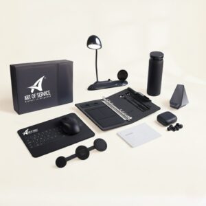
Between remote work, hybrid meetings, and total reliance on technology, the concept of office work has changed. With the massive... Continue reading

The world awaits a major historical event on November 1, 2025: the grand opening of the Grand Egyptian Museum (GEM).... Continue reading

Behind every piece of paper and document is an entire world you might not know much about… It starts with... Continue reading

Where Brands Come to Life: The Origin Story In a world full of noise, standing out isn’t easy. But when... Continue reading
Add comment